

Step away from the pies. Have a doughnut instead.
Pie charts are not great, for a host of reasons. And some people really hate them. A much better alternative is their cousin: the doughnut chart.
When is it OK to use a doughnut chart?
If the following rules are all true, then go ahead and create a doughnut chart.
Rule 1: There are a small number of data points. Ideally only 2. But 3 is OK, 4 is acceptable, 5 is probably the limit.
Rule 2: The numbers add up to a whole. Such as votes, or percentages, or proportions.
Rule 3: No tiny numbers. Never have a slice that’s too small to see.
But If any of these rules are not true, you are usually better off with a bar chart. And you are probably better off with a bar chart anyway.
When is it OK to use a pie chart?
Almost never. Maybe when they are very small and only have 2 data points.
Why is a doughnut better than a pie?
There are three reasons why I always use a doughnut and never a pie. It’s a combination of representing the numbers well, looking good, and flexibility.
1. Easier to gauge
The brain can judge the size of the doughnut slices better than pie slices. So if one number is three times bigger than another, it is easier to gauge that from a doughnut. In short, our brains are better at comparing the length of the curve of a donut section than the area of the slice or a pie.
2. Less digital ‘ink’
Pie charts use too much filling (pun totally intended). They hog your attention. But doughnut charts are more subtle and can be made smaller while still being readable.

3. Labelling flexibility
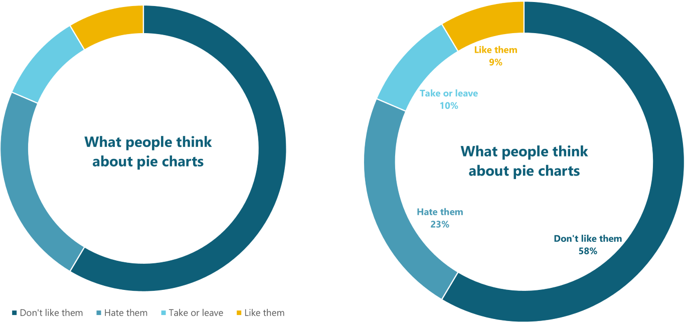
The doughnut frees up all that screen estate in the middle. This is a great place to put the title and even a legend if you need one. And sometimes you can even fit the labels inside. In this way, the doughnut chart is quite self-contained. Ideal for dashboards.

How do I create a doughnut chart?
In the same way as a pie chart:
Insert > Chart
Choose Pie on the left
Choose Doughnut on the right
Adjust the thickness of the doughnut by adjusting the size of the hole. I usually find 80% is the sweet spot (pun 100% intentional again).
If you have already created a pie chart you can quickly change it to a doughnut. Select it, go to Chart Design > Change Chart Type and select Doughnut on the right.
Tips for using doughnut charts
Put the title in the centre
A pithy chart title can sit neatly in the doughnut hole, freeing up valuable space on a slide. All you have to do is drag it to the middle, and centre the text.
But you’ll find it much easier to create your own title, because you’ll find it easier to position and format it:
Delete the default chart title - just select it and press the Delete key on your keyboard
De-select the chart. In other words, click somewhere else on the slide so that the chart is not selected. If you skip this step, the new chart title will be embedded in the chart, which will make aligning it harder
Insert a text box: Insert tab > Text box
Type your title, format it as you need, then use the alignment tools to centre in the chart. Or you can do that by eye.
Colour-code the data labels
It’s tricky for readers to keep looking at the legend and back again. So ditch the legend and just put the data name and value in a data label, then colour code to match the doughnut segment.
Group small numbers as ‘Other’
Pies and doughnuts only really work with relatively large proportions. But small percentages become difficult to see, and very difficult to judge the size of. So add up the small numbers and plot a single slice. Calling it ‘Other’ or ‘Others’ is a good default, but it depends on the context of your data.

If your audience will be interested in what the ‘other’ slice includes, give them that list in a footnote. Don’t leave them wondering; that will reduce the impact of your chart
Attribution: main image uses graphics designed by Freepik
Want more tips like this in your inbox?
It's useful*
It doesn't flood your inbox (monthly-ish).




.jpg)
.png)
.png)


