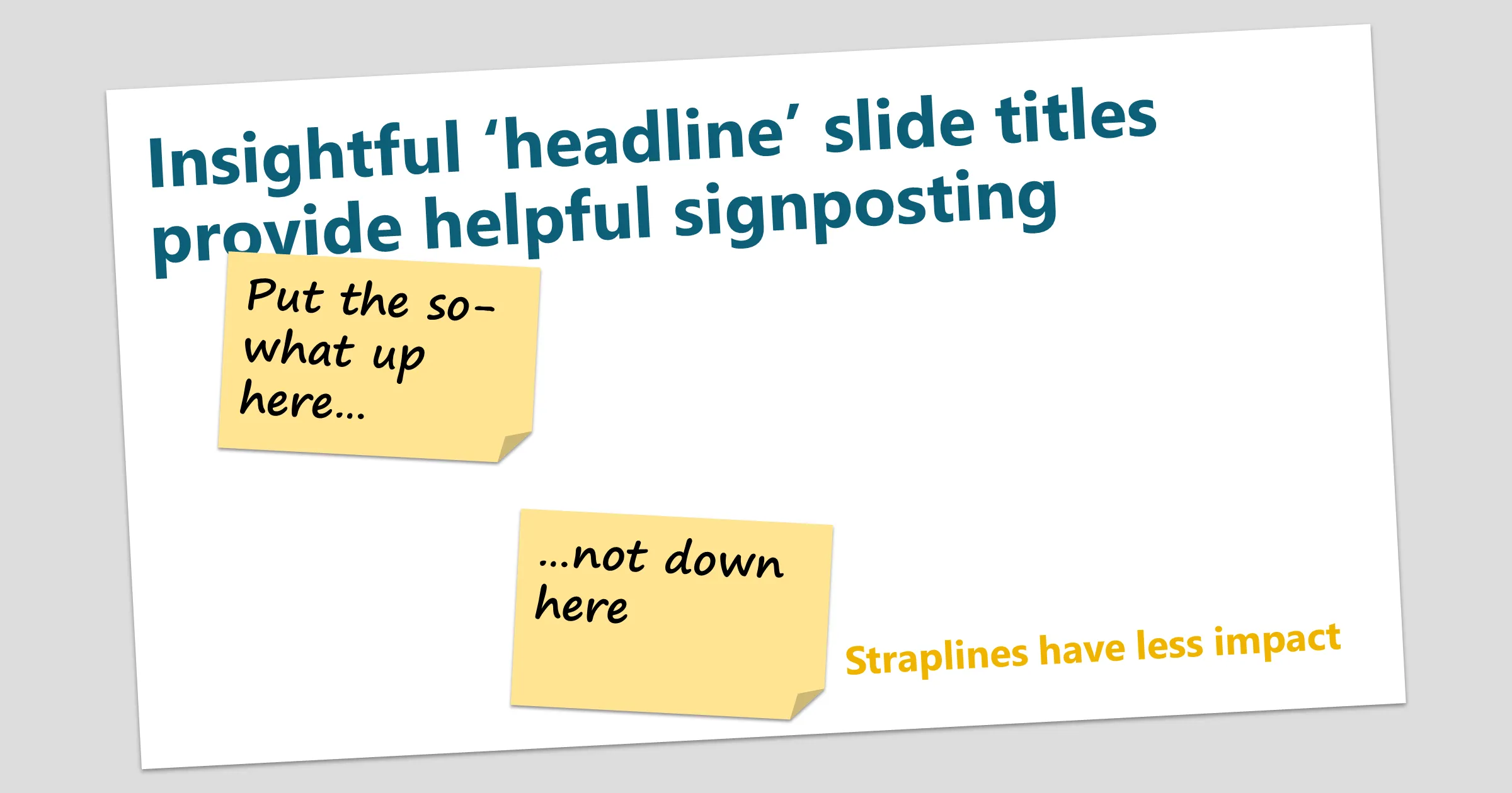


Headlines, not straplines
I frequently see slides with a ‘strapline’ - by which I mean a conclusion at the bottom of the screen, often sitting in a bold coloured box, or using large coloured text. Perhaps this feels like it makes sense, like a mathematical proof. But it’s not always effective.
People expect to read slides from top to bottom, left to right. But there is also a visual information hierarchy which means the biggest, boldest item grabs the eye first. So there will be a cognitive disconnect if the shoutiest thing on the page is the last in the reading order.
You will make more impact by making the most important thing on the page also the first thing: the slide title. You can signal the whole point of the slide before people start read the content.
This is exactly what a well-written news article does. The headline catches the attention and summarises what the article is about. So even if you don’t actually read the article, you have a sense of the news contained within.
Use slide titles as headlines
When you use PowerPoint to create a document, your audience is probably going to read it without the benefit of your voiceover. Use your slide titles to lay down your narrative track to help them follow your train of thought. You can remin
It’s simple enough: make each title the headline of the slide content. A headline is simply a sentence (or two) that summarises the ‘so what’ of the slide. It lays out the conclusion of the slide, and your audience can read the rest of the page to believe you.
Importantly, you have sewn the seed of what you want them to understand before they get to the detail. And if they don’t have the time or energy to read and process the whole slide then they still have the right take-away.
Another way of looking at this is that the slide title is saying “This is the point I am making…” and the contents are saying “...now believe me”.
Writing a good slide title
Boiling down a slide into a few words takes practice. Some tips:
Be pithy. Be punchy. Be ruthlessly concise.
Provide insight. Give a ‘so what?’. You are presenting information, but help your readers to understand what it means for them.
Be natural. If you can’t comfortably read your title out loud, redraft it.
Don’t use labels. Don’t say ‘Summary’ or ‘Approach’. Write a full sentence or two. This means you might need to run into two lines. But try to avoid three lines – remember: ‘be pithy’
To check whether your slide titles are working, assemble just the slide titles and read them in order. Do they tell the story you are trying to convey? PowerPoint Tip: use Outline view and collapse all the content to see just your slide titles. Then read them out loud to yourself.
Example
In this example, a business unit needs to create a business intelligence and reporting solution. It can either take a clone of the solution from another part of the business, plug in an SAP solution, build a greenfield solution from scratch using a cloud-based data and reporting tool, or limp on with aging legacy solutions.
This slide is just one from a deck presenting the pros and cons of the options.
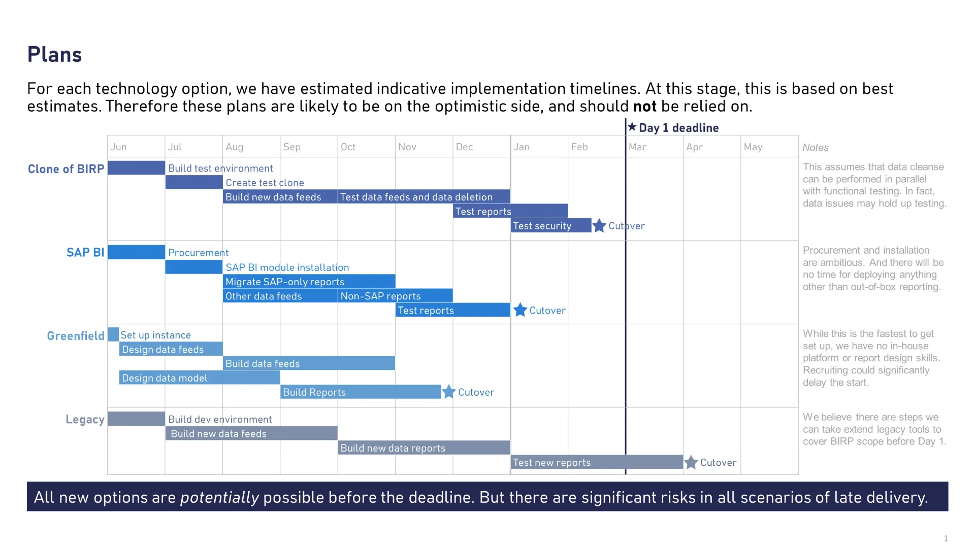
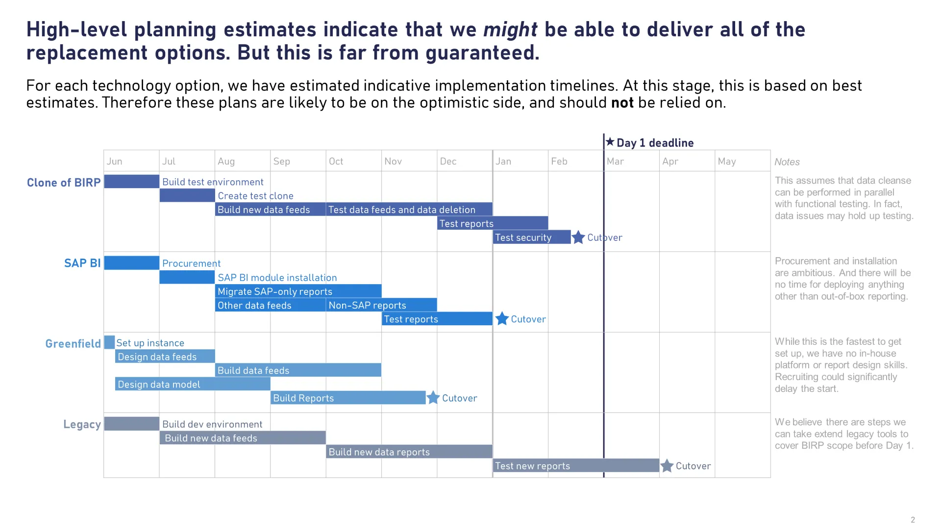
We don’t need to make a major change to this slide, we can simply use a slightly reworded version of the strapline as the slide title.
| Instead of: | Try something like this: |
|---|---|
| Plan | The plan spans 18 months and is split into three phases. We are currently 2 weeks behind but expect to catch up by June. |
| Approach | We are using a four-lane approach that covers the network connectivity, application suite, processes and change management |
| Business Case Summary | Summary: we need to set up a Transformation Programme. This will cost £35M CAPEX over 5 years but reduce OPEX by £11M per year. |
| Change Impact Assessment | The biggest impact will be felt by shop floor staff but significant changes will hit Finance and Supply Chain teams first |
What if my conclusion is complex?
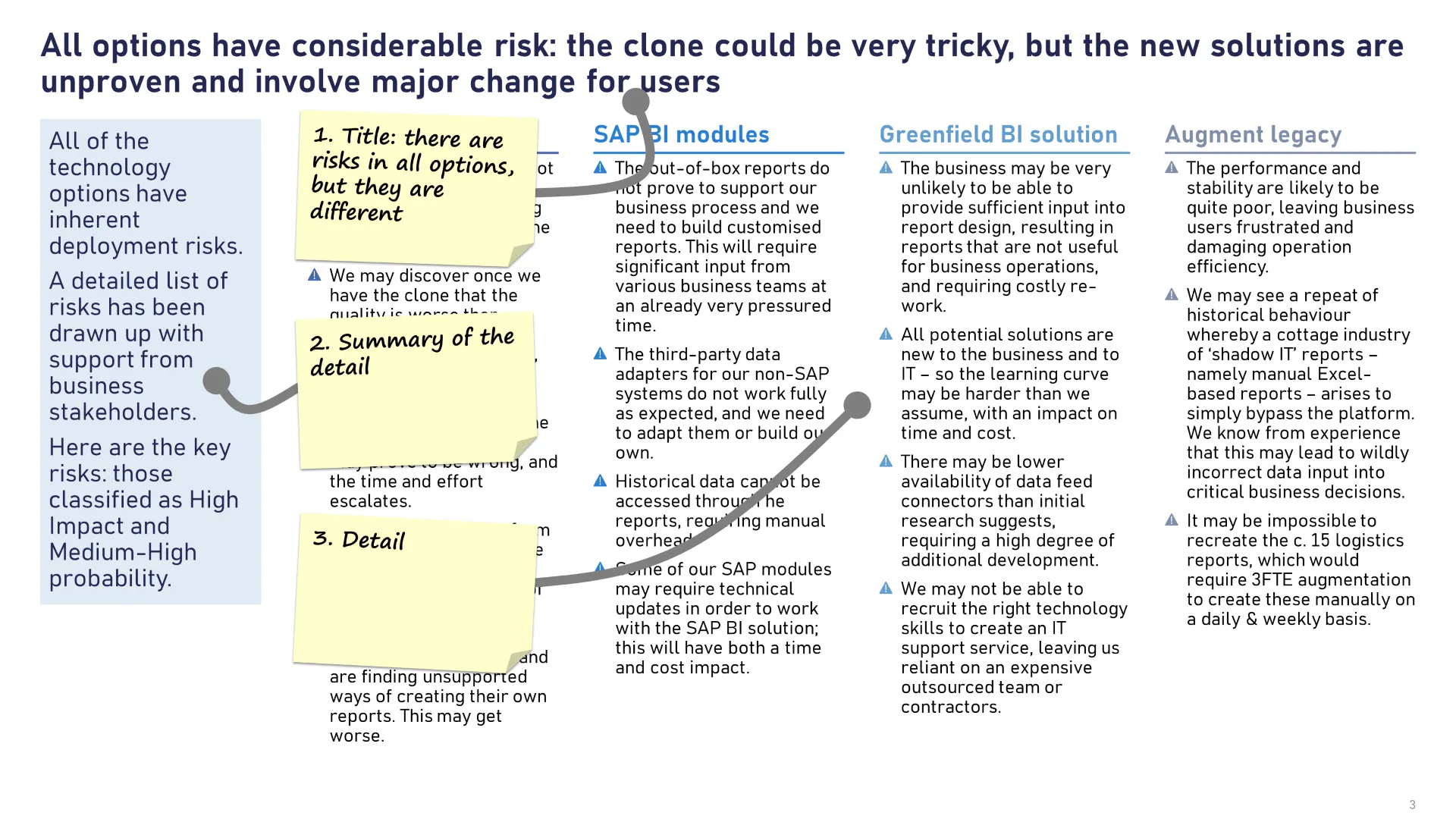
If you worry that condensing the ‘so what’ into a concise headline will lose some nuance, then you can add a layer to the hierarchy of information:
- Title headline
- Box-out with summary level of detail. Make this stand out - a coloured fill works well
- The remaining detail on the rest of the slide
What if my conclusion is very important?
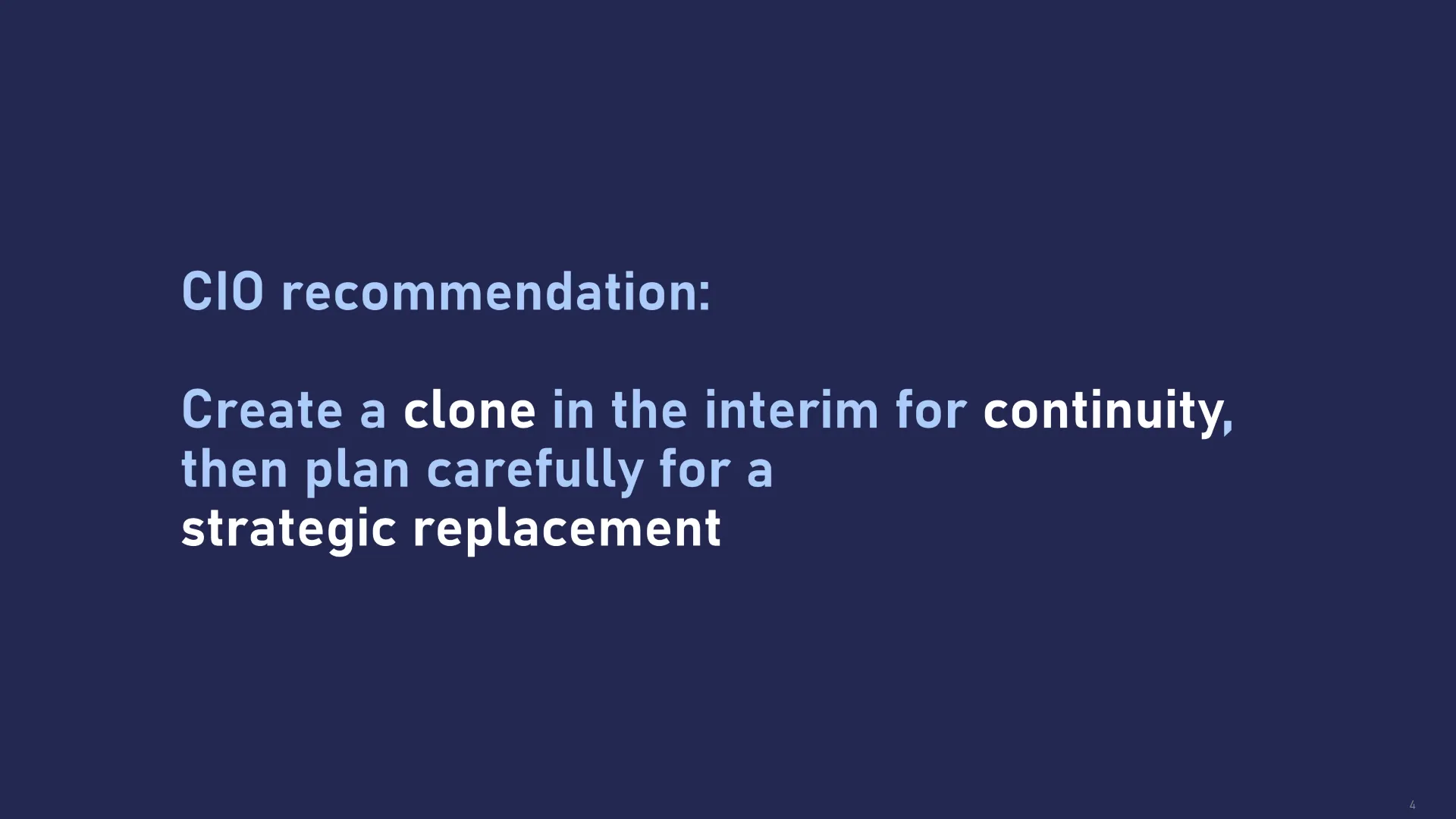
If you need to land a point that is much more important than the other slides in the deck, simply make it stand out by putting on the slide on its own. Write it large.
There are many different ways of doing this but the simplest is to set the background of the slide to one of the template colours and then use big, bold text in the centre of the slide.
The key take-away is that using well-written slide titles can help guide your readers through a complicated narrative. But putting those key points along the bottom of the slide might mean they get completely overlooked.
Want more tips like this in your inbox?
It's useful*
It doesn't flood your inbox (monthly-ish).




.jpg)
.png)
.png)


