.webp)

How to use playing cards as a metaphor for choice
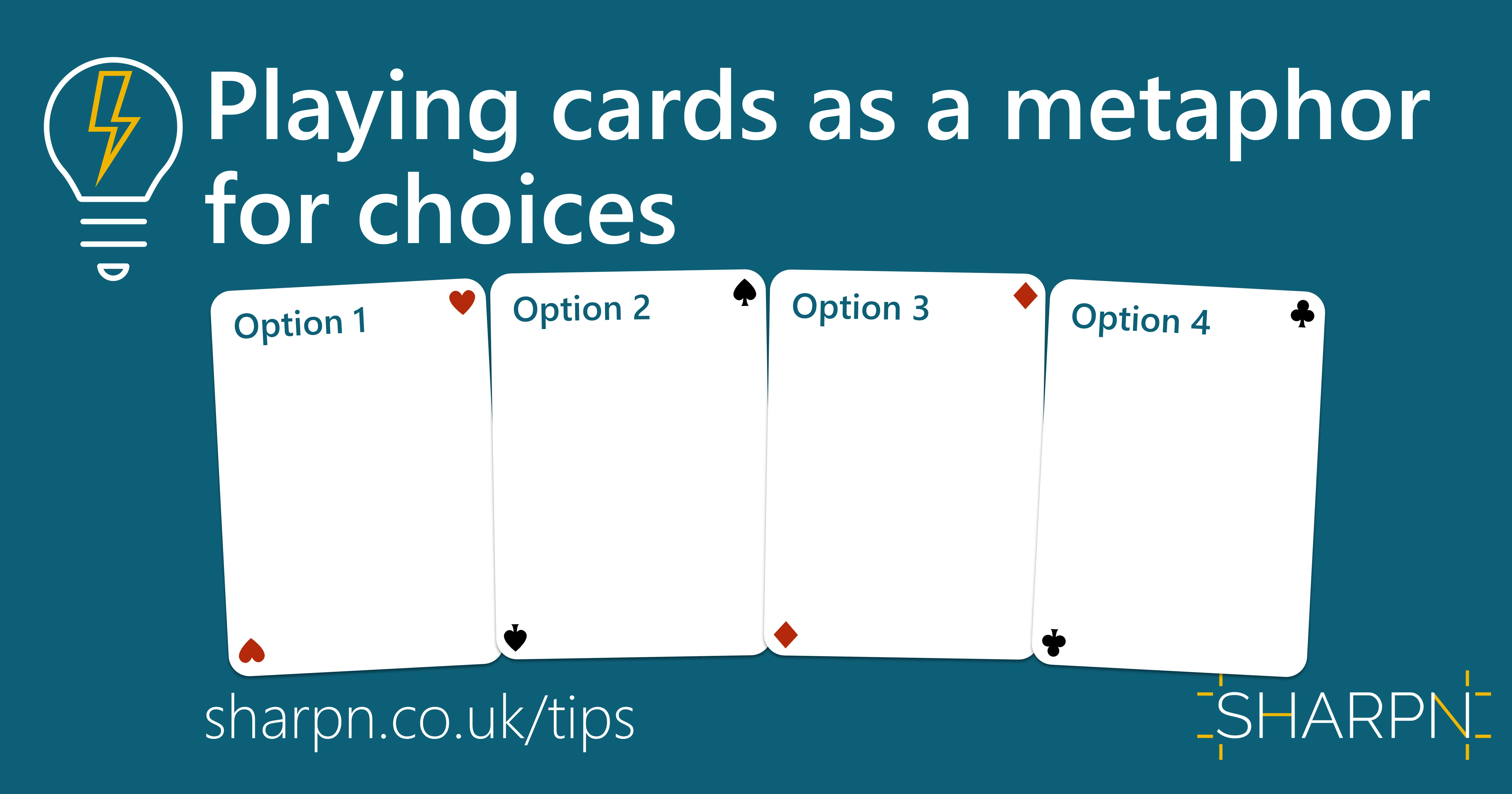
In many documents or presentations, you need your stakeholders to make a choice. In fact, the whole purpose of the deck might be to drive that decision. One way of indicating that a decision is required is to provide a not-so-subtle visual clue by presenting the choices as a set of playing cards. Literally: pick a card…
And it’s very easy to create.
Step 1: Draw and format one card
Create a rounded rectangle in the rough aspect ratio of a playing card. (A standard playing card ratio is 7:5, so you could set the height as 7cm and the width as 5cm, then scale while holding down Shift . But you don’t need to be exact.)
At this stage you’ll have to guess how big the card needs to be; you can adjust it in a moment.
Set the rounded corners so they look about right for a playing card. No right or wrong amount here, just what feels OK. The default looks quite good in fact.
Set the fill to white. But feel free to choose a different colour.
Use a pale grey for the outline or set a very subtle drop shadow. The one one in the example below has the settings as shown in the screenshot.
%2520(1).webp)
Step 2: Duplicate for each option
Make a copy for each option you have. CTRL+D (CMD + D) will duplicate an object and is the same as CTRL+C, CTRL+V. But quicker.
Label them. Make sure you give each option a number or letter so it is easy to refer to them.
.webp)
Step 3: Add the details
Add a title and any content that you need to each option.
If you need to resize a card to fit content in, make sure you resize them all by selecting all cards and then resizing them together.
If you add other content such as images, then group together so each card is one object.
.webp)
Step 4: Arrange the cards
To drive home the ‘pick-a-card’ metaphor, you can fan the cards. This is optional; you could just distribute them on the slide. But fanning will create a slightly more impactful, memorable image.
Add a small rotation to each card. Starting with the left-most, rotate slightly to the left, ending up with a slight right rotation on the last card. The best way to make this balanced is to use the Format Pane: right-click on one of the cards > Size and Position and use the up and down arrows in the Rotation box. You need at most 2-3° difference between each card.
Align and horizontally distribute the cards to even them out.
If they are overlapping, use the Home >Arrange>Send Forward/Backwards commands to put the left-most one underneath and the right-most one on top.
.webp)
That’s it. You could extend the metaphor by putting hearts, diamonds etc on the cards using Insert > Icons. But be mindful about whether this might tip the metaphor into one about taking a gamble rather than making a choice, and whether that is appropriate in your context.
.webp)
Want more tips like this in your inbox?
It's useful*
It doesn't flood your inbox (monthly-ish).


.jpg)
.png)
.png)


