

How to step away from the bullet points – and what to replace them with
No matter how visually compelling you make your PowerPoint document, you still need text. In fact, PowerPoint isn’t just for presentations – many companies use it as the de facto format for documenting almost everything. And it’s a powerful and entirely appropriate tool for doing that. Even text-heavy pages can work well in PowerPoint.
And yet there is one widespread bad habit that needs to stop: bullets on every line of text. It’s an ingrained default, often accepted without question. But bullets are only really needed in very specific situations – so let’s reset the default to no bullets.
Why should I avoid bullets?
They aren’t just death-by-PowerPoint’s weapon of choice. There are three reasons to avoid bullets.
Firstly, they add visual noise, while being ineffectual visual cues. What I mean by that is that the small dot gives the brain more to process, but doesn’t add any value to a paragraph. We already know when a new paragraph starts – it’s on a new line. And when you are reading a paragraph, the bullet is in your peripheral vision - so in effect you don’t really see it until you get to it.
Secondly, bullets infer that each paragraph is a discrete logical point of information. A reader might assume that three bullets equals three key things. This isn’t necessarily true, and could result in someone missing vital information.
Lastly, the design ‘crime’ of bullets is that they push the text to the right, reducing the amount of space it has. And at the same time the text is unlikely to be aligned to any headings or other visual elements.
If bullets are so bad, why do we do it?
You wouldn’t automatically add bullets to all your emails, and you don’t see bullets in books or magazines. Or in this post. So why is PowerPoint the only place you regularly see bulleted paragraphs?
History and human nature are to blame. In 1987 when PowerPoint was born, graphics capabilities were limited and bullets were one of the few things you could do with text. Somebody decided that text placeholders would default to bullets, and people simply assumed that this was a design recommendation. They saw their peers using them, and a habit was born and reinforced over years and years..
It’s time for a new habit.
OK, you convinced me. What should I do instead?
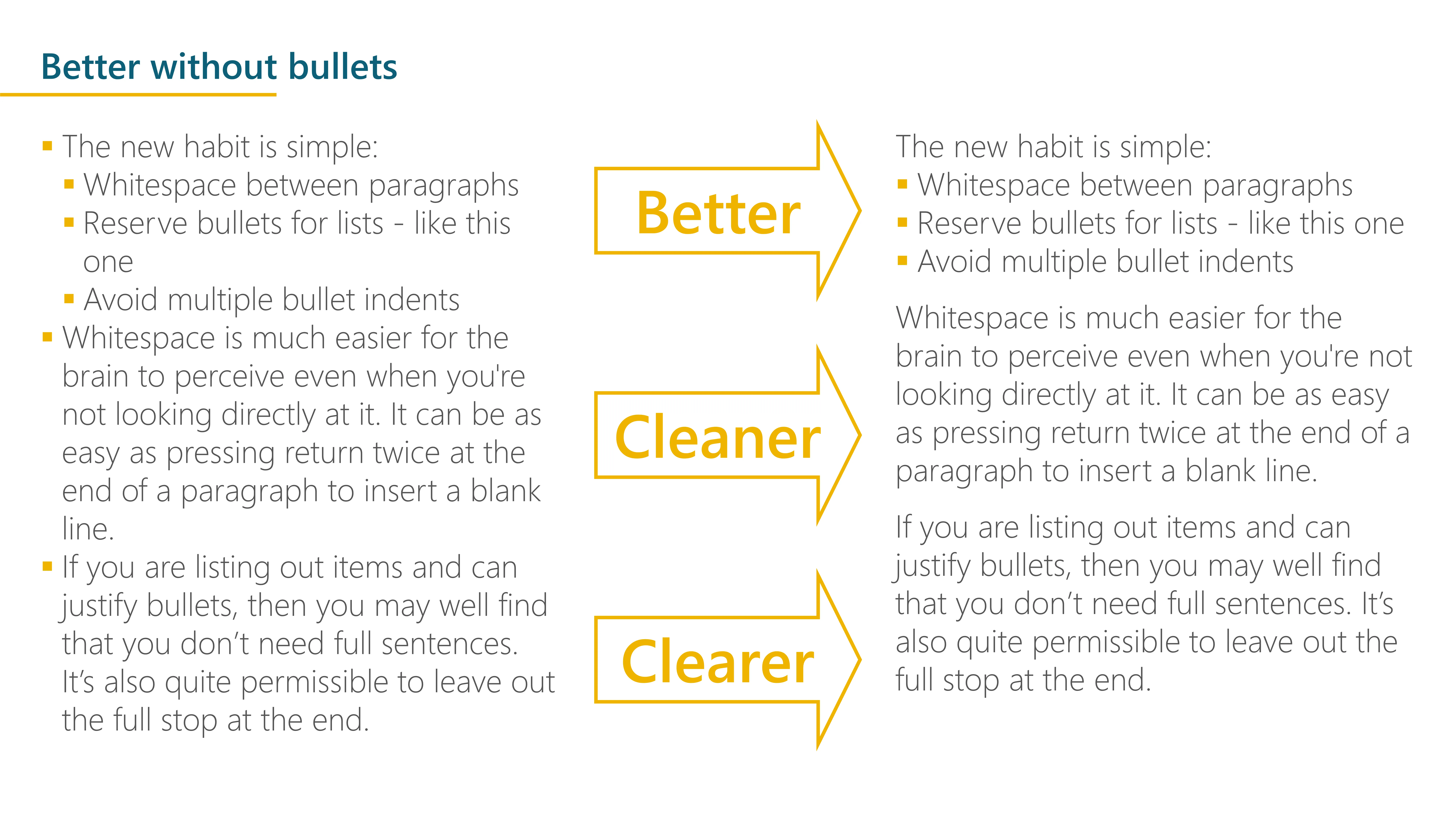
The new habit is simple:
Whitespace between paragraphs
Reserve bullets for lists - like this one
Avoid sub-bullets

Whitespace is much easier for the brain to perceive even when you're not looking directly at it. It can be as easy as pressing return twice at the end of a paragraph to insert a blank line.
I’m not proposing completely banning bullets - just restricting them to lists of short items. One rough rule of thumb is that bullets don’t need full sentences. It’s also quite permissible to leave out the full stop at the end of bullets.
And if you find that you have a complex list that might warrant sub-bullets and the multiple levels of indents that brings, challenge yourself. You may find that a simple table will work better.
How do we achieve that in PowerPoint?
You could just keep turning the bullets off, but that will get tiresome quickly. A far better approach is to change the slide master, so that the main text doesn’t have bullets, only the indented text. See the end of the article for how to do that.
Once you have set up the text levels how you need them, you can quickly increase and decrease the levels with the keyboard: Shift+Alt+←/→ (Cmd+ [/] on Mac). Learn this shortcut, it’s a huge timesaver.
Try to get into the habit
Next time you start typing and a bullet appears, challenge yourself: do I need that bullet? To be fair to Microsoft, their newer template designs in M365 often don’t include bullets for Level 1 text. And many corporate templates are created more thoughtfully. But bullets are likely to persist for a while, so set a good example, and step away from those little dots.
If you want further techniques for increasing the impact and quality of your decks, we provide advanced training and PowerPoint coaching. Get in contact to find out more.
📖 Guide: How to set bullets in the slide master
PowerPoint has up to 5 levels of text indentation, although you should rarely have occasion to use more than the first 2. So:
- Open the slide master: View > Slide Master
- Scroll up to the Master slide and select it. This is the larger ‘parent’ that controls the defaults.
- Select the main text box – it usually says ‘Click to edit Master text styles’ followed by ‘Second level’ and so on.
- Select Level 1 (the first line) and turn bullets off: Home > deselect the Bullets button.
- You may also need to set the indent to zero – you can either do this using the ruler (View > Ruler if it isn’t showing). Or open the paragraph options window by selecting the small diagonal arrow in the Paragraph ribbon section and setting Indent to zero and Special to None.
- Select Level 2 (the second line). You may need to pick a better bullet symbol if the template designer has left the defaults in – click the dropdown arrow next to the bullets button on the ribbon.
- Left align the bullet with the Level 1 text above – i.e. an indent of zero – and give the text a suitable indent. Keep this gap between bullet and text fairly small. For font sizes up to 24, 0.5cm works well.
- Repeat for levels 3-5 if you want to, but it’s usually not necessary.
- Now go back to the normal view: on the Slide Master ribbon, click the Close Master View button.
You should see the changes applied to any text placeholders on your slides. You may need to reapply the layout: Home > Reset. In some circumstances, you may need to repeat the above steps with some of the different layouts back in the Slide.
You can also set text to insert space after each paragraph in the same way. Back on the slide master, select the Level 1 text, then click the small arrow in the Paragraph ribbon section (or Home > Line spacing > Line spacing options) and set the space after to something like 6pt or 12pt. This will save you manually entering blank lines. And ensure consistency through the document.
Here’s a recording of all that:

Top tip: if you open a second window for the document with View > New Window you can go to the Master Slide view in one window and see the effect of the changes on your slides in the other window, without having to keep leaving the Slide Master view.
Want more tips like this in your inbox?
It's useful*
It doesn't flood your inbox (monthly-ish).


.jpg)
.png)
.png)


