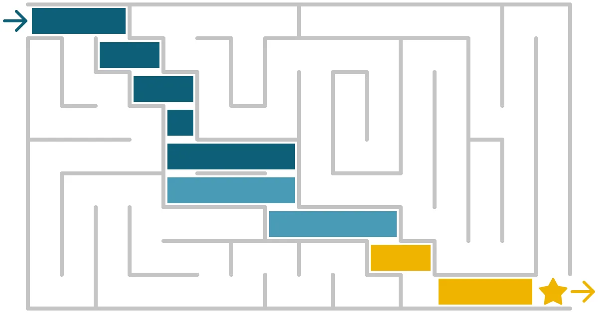


Gantt is a language – are you speaking it clearly? How to make plans clear and effective.
People know how Gantt charts work because they have learned their visual ‘language’. With their left-to-right, top to bottom ‘grammar’ and their simple ‘vocabulary’ of bars, milestones and connectors, Gantt chart is easy to ‘speak’.
This natural ability we have to understand icons, diagrams and charts is called graphicacy. Graphicacy is to visual information what literacy is to the written word. And numeracy is to numbers. In the same way that language and maths have rules and symbols with specific meanings, so do visuals. Apps are accelerating our visual fluency: the ≡ ‘hamburger’ menu icon is a perfect, globally-recognised example.
Perfecting the simple language of Gantt charts is easy – and it can make your plan slides much more effective.
The first step is deciding exactly what the purpose of the plan is.
What do stakeholders need from your plan?
The people reading your plan only need two things: information and confidence.
Stakeholder need #1: Information
The information they need will vary by their role and their relationship to the project. Some people want to understand the process and how the timings break down. And – if you are in the middle of delivery – how closely is the reality matching the plan? How can they help you if you have delays?
But some stakeholders are less bothered by the steps. They only really need to know when they will get something: when are the main milestones, the launches, the go-lives? The things that will make a difference to them.
So when you draft your plan, think very carefully about the level of detail you include. It’s not an opportunity to demonstrate how much effort you have put into planning. It’s a tool to explain to the stakeholders what they will experience, and when.
Stakeholder need #2: Confidence
Regardless of how much detail you show, the plan has to persuade your stakeholders that you know what you are doing. They need to be able to believe it. And believe you.
A plan crystallises a set of abstract concepts into a specific timetable, so it has to appear precise. Fuzziness or inconsistency can damage the plan’s credibility. And, therefore, your credibility.
What do you need from your plan?
A plan slide is an important part of how you communicate to your stakeholders – and your team. Most plan-on-a-page slides will be used multiple times, in multiple decks for multiple audiences.
You need a plan that helps you. A great plan will make it easier for you to explain what is happening, across a variety of stakeholders and a range of situations. And it will drive up levels of trust (assuming it’s realistic).
So how do you create a great plan?
It’s a simple enough recipe:
- A clear, neat timeline. Use a table (never lines or boxes). Legible, but not getting in the way of the plan itself.
- Clearly structured tasks at the right level of detail. Remember: what do the stakeholders really want to know?
- Context. Draw attention to the most important parts of the plan. Highlight the information the audience might be looking for - especially around delays.. Simple callouts or post-its are all you need.
- Tidiness. Time spent aligning tasks to the timeline, and to each other. Equalising sizes and spacing.
I can’t tell you strongly enough how important tidying is on a plan slide. It’s not me being picky or perfectionist. It’s this:
Tidiness infers Quality. Quality inspires confidence.
Learn to build brilliant plans
At SHARPN, we’ve developed a robust approach to creating a high-quality plan using built-in PowerPoint features. And we've turned that into a self-study training course.
But because building a good plan takes time, we've also created a plan kit with over 100 different reusable timelines, and a set of reusable 'sticker-book' graphics. So you can quickly create a slide that will impress your stakeholders – which means they are more likely to trust you, and your plan.
The course
The course covers what to put in a plan so it is clear and helpful to your audience, and how to make it look high quality – so that they trust it. Plus tips and tricks for using PowerPoint features to draw it. It includes:
12 lessons
2.5 hours of crisp 4k video content for clear demonstrations
Practice exercise
The kit
114 timelines spanning 12 hours to 5 years
Available sized for both centimetres and inches
Picks up your template styles to merge seamlessly into your deck
Pre-sized task bars to make building the plan quick and easy
Sticker book of useful graphics: milestones, labels and connectors for drawing the plan, plus status and delay indicators, and callouts for adding notes
No add-ins to subscribe to, and no messing around with Excel
How to get the plan and the kit
We want to provide a flexible learning experience. So we sell the course and the kit separately to allow you to either learn the techniques, or to get a time-saving kit if you are already confident. Or you can buy both. If you choose to buy just one, you can always come back and purchase the other part later, but you'll get a discount if you buy them together.
A taste of the course and the kit
If you have a complex programme that needs a clear plan-on-a-page, we can help you build it. Or if you want your teams to learn how to create better plans and other business documents, we can train them.
Want more tips like this in your inbox?
It's useful*
It doesn't flood your inbox (monthly-ish).



.jpg)
.png)
.png)


