

How to create better headshots in PowerPoint
Sometimes you want to put faces on a slide. Perhaps you want to inject some humanity into an org chart. Maybe you’re bringing feedback to life. Or you could be building a profile on someone - perhaps even yourself.
The photos you have are likely to be of variable quality and style. One person may have provided you with a professional headshot (perhaps looking suspiciously younger). Others may have given you a lovely holiday snap or their Instagram profile picture. Assembled together, the inconsistency will reduce the quality and impact of your slides.
Here’s how to quickly fix that
The good news is that you can easily turn what you have into something that looks a lot more professional – and you can do (nearly) all of it in PowerPoint.

Step 1: Remove the background
The chances are that you don’t have access to Photoshop, or the experience to wield it. And the remove background tool in Photoshop is terrible.
Luckily there are now a few good free websites that will do it for you. We currently recommend the Icons8 background remover tool. Or you can try remove.bg.

Step 2: Crop to a square ratio

This is the first step to making the headshots all look similar: getting them in a square (1:1) ratio.
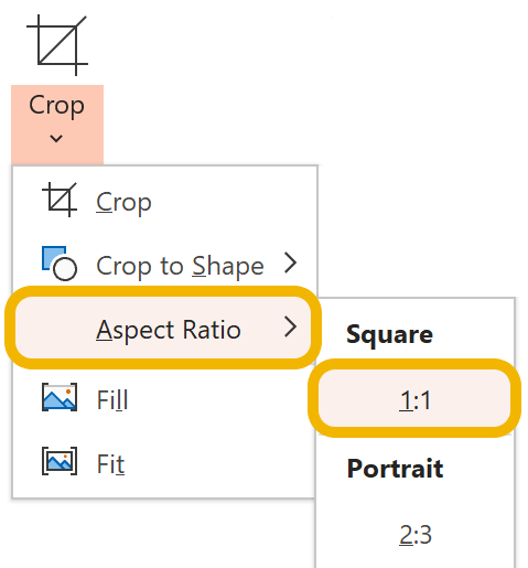
Select the photo
Picture Format > Crop > Aspect ratio > 1:1
Adjust the crop so the head and shoulders are centred and fit well within the square. If you do this with the white handles holding down Ctrl + Shift, you won’t accidentally squash or stretch the picture.
Press Esc or click away from the photo to apply the crop. You can go back and adjust the crop later if you need do.
There is no way to apply this to multiple photos at once. To save clicks, you can right click on the 1:1 menu option and add it to the Quick Access Toolbar.
You can stop here if this look works for you. But there are three extra steps that you should think about. These are all optional and independent of each other, although we think they work best together.. So pick and choose which work best for the look of your deck.
Optional Step 3: Make them circular

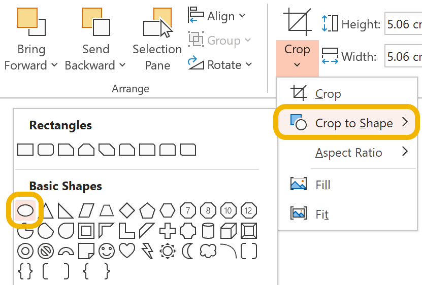
Turning the headshots into circular ‘badges’ is a really nice look, and incredibly easy:
Select all the photos (use Ctrl + click or Shift + click to select multiple items
Picture format > Crop > Crop to shape > choose the Oval
It’s important that you have already cropped to a square ratio, or you will end up with ellipse shapes. If you do have a squashed circle, just set the aspect ratio back to 1:1 as in Step 2.
Optional Step 4: Black and white

Your original set of pictures will have been taken under different lighting conditions and at different levels of quality. Even once you have removed the background, they will still look quite different.
The easiest fix for that is to turn them all black and white:
Select one photo
Picture format > Colour > Saturation > choose the first option. This is 0% which means black and white.
Select the next picture and press Ctrl + Y (Cmd + Y on macOS). This will repeat the previous action, so will turn that picture black and white.
Optional Step 5: Background colour
Adding a quick fill colour to the photo helps to even out all the photos by making them all appear the same size. If you are using a circular shape, it also shows the whole circle. Again, this is really easy: just apply a Shape Fill colour to the picture.

This works particularly well with black and white photos, and helps to apply some of your brand colours to the photos while making them look all very consistent.
Taking it further
While we don’t advise going crazy with this, you could try a different crop shape. Perhaps a rounded rectangle or a teardrop.

Bonus: reduce file size
Adding all these pictures in will inflate your file size considerably. Given that the pictures are not likely to be very large, it won’t hurt to compress them, and remove the bits you have cropped off to make them square.
Do this once you are happy with the final slide:
Select all the photos
Picture format > Compress Pictures
Check the Delete cropped areas of pictures box
Select the highest quality available from the list, and click OK.
Want more tips like this in your inbox?
It's useful*
It doesn't flood your inbox (monthly-ish).


