

How to make the most of PowerPoint's inbuilt icon library
If you've never used the icons: go to Insert>Icons and pick the one(s) you want, either browsing by category or searching on a keyword. Then click Insert. You can recolour them like any other shape using Shape Fill.

Microsoft quietly introduced an icon library to Microsoft365 in way back 2017. It wasn’t great at first. Certainly nowhere near as good as The Noun Project (which is still excellent value and highly recommended).
Then Microsoft refreshed it in 2020 and now it’s the first place I go to – because there’s a good range of icons with a really consistent design aesthetic. Plus most are available in an outline version or a solid one. And the workflow is so easy: they are right there in the ribbon.
Formatting and customising icons
The inbuilt icons are SVG (scalable vector graphic) format which gives you freedom to adapt them.
To get more control over the icons, turn them into shapes: Graphics format > Convert to Shape. (In Windows, you can achieve the same by ungrouping the icon: Ctrl+Shift+G.)
If you ungroup and group again (Ctrl+Shift+G then Ctrl+G) that will remove the empty 'padding'. This is useful if you want to align the icon with something else on your slide. [For Mac users, CMD+Option+G and CMD+Option+Shift+G will group and ungroup.]
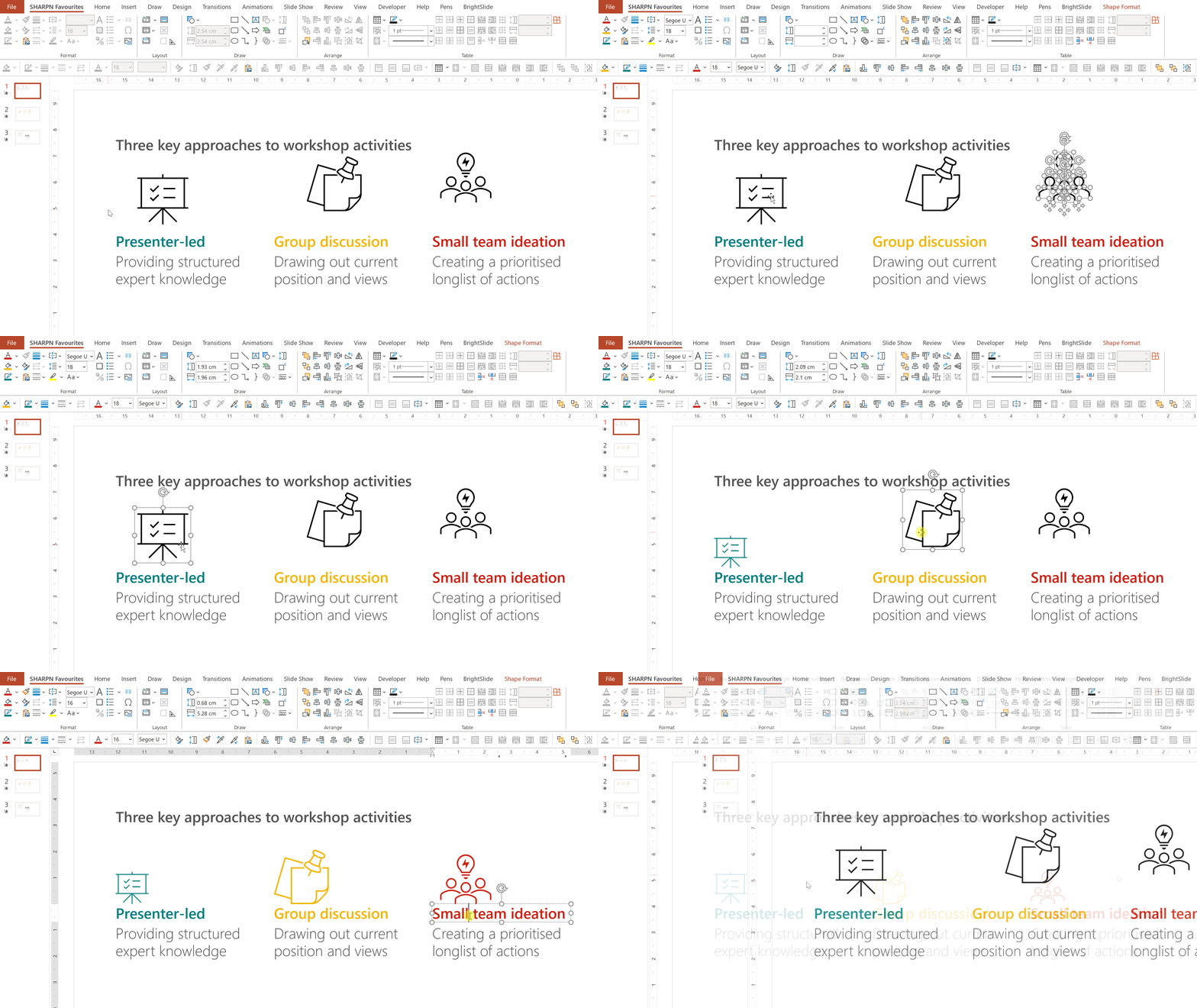
You can add more colour by selecting the individual components and changing the fill. Be careful, don't go wild. Perhaps a single highlight colour on certain components of the icon.

If you can’t quite find the icon you need, you can remove parts of them or add shapes from other icons to customise them.
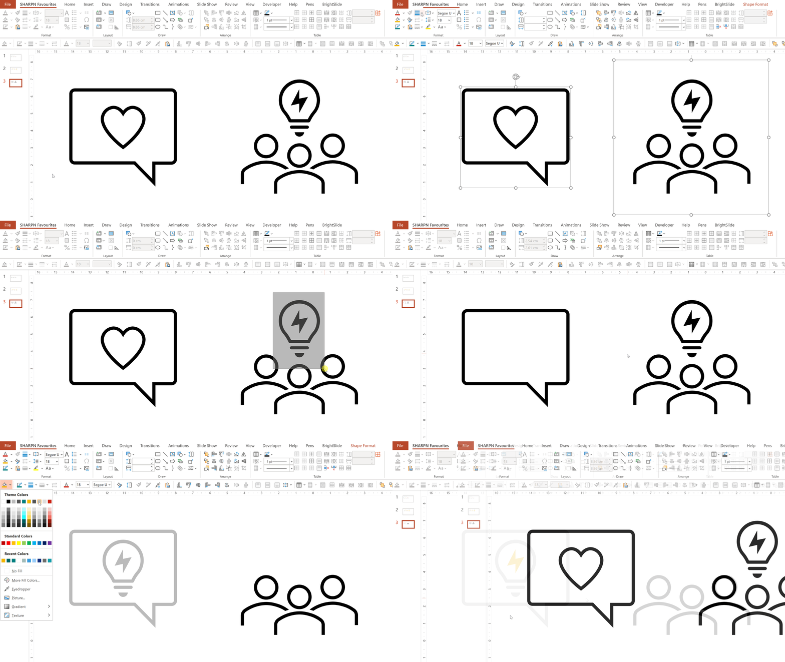
Note that whether you can select the separate parts of an icon will depend entirely on how they have been designed. It isn’t always possible to isolate the component that you want. For that you would need to use a proper graphics design tool such as Figma.
Room for improvement
We hope that Microsoft continues to expand this resource. An even larger range of icons would be helpful. As would the ability to create a personal list of favourites to save time for icons we use a lot, plus a better way of browsing categories. There’s also a bit of a bug in the icon search; the solid and outline versions of the same icon don’t show up next to each other all the time.
Alternative icon sources
As mentioned above, The Noun Project is fantastic. The only drawback is the sheer volume of icons, so finding the right one can sometimes take a while. Other icon sites are available – see the starter list below.
And there is another source of free, inbuilt icons: fonts like Segoe MDL2 Assets, Segoe UI Symbol and Segoe UI Emoji. We’ll talk about uses for those in a future article.
Other icon websites
These examples have a variety of free and paid icons.
Flaticon
SVG Repo
Google Material Design
Orion
Graphic Burger
Icon Store
Icon Finder
Icons 8
Sidenote: many of these offer multicolour icons, But use these sparingly: don’t use too many and limit the number of different colours.
Looking for more tips like this?
If you want to find out even more techniques for increasing the quality of your decks, we provide advanced training and PowerPoint coaching. Get in contact to find out more.
Want more tips like this in your inbox?
It's useful*
It doesn't flood your inbox (monthly-ish).


