

How to use the full range of free images in PowerPoint
Perhaps you already use the icon library inside PowerPoint (and if you don’t, read this article). But wait: there’s more. The icons are part of a wider graphics library, which is richer and more useful than you might think.
Photos
It’s not a huge library by the standards of sites like iStock or Shutterstock. But it is free, and has a decent range of good quality photos right there in the PowerPoint ribbon. Importantly, the diversity of people represented seems reasonable. My litmus test is always to see what a search on ‘meeting’ brings back. In this case it definitely isn’t all straight white men in suits.

Photos are great in presentations - they help the audience connect with your message. In a document, use them mindfully: make sure they serve a purpose, and are not just there to make a page look ‘pretty’. The photo subject needs to link with the content on your page – done well, this can help people remember key points.
Cutouts
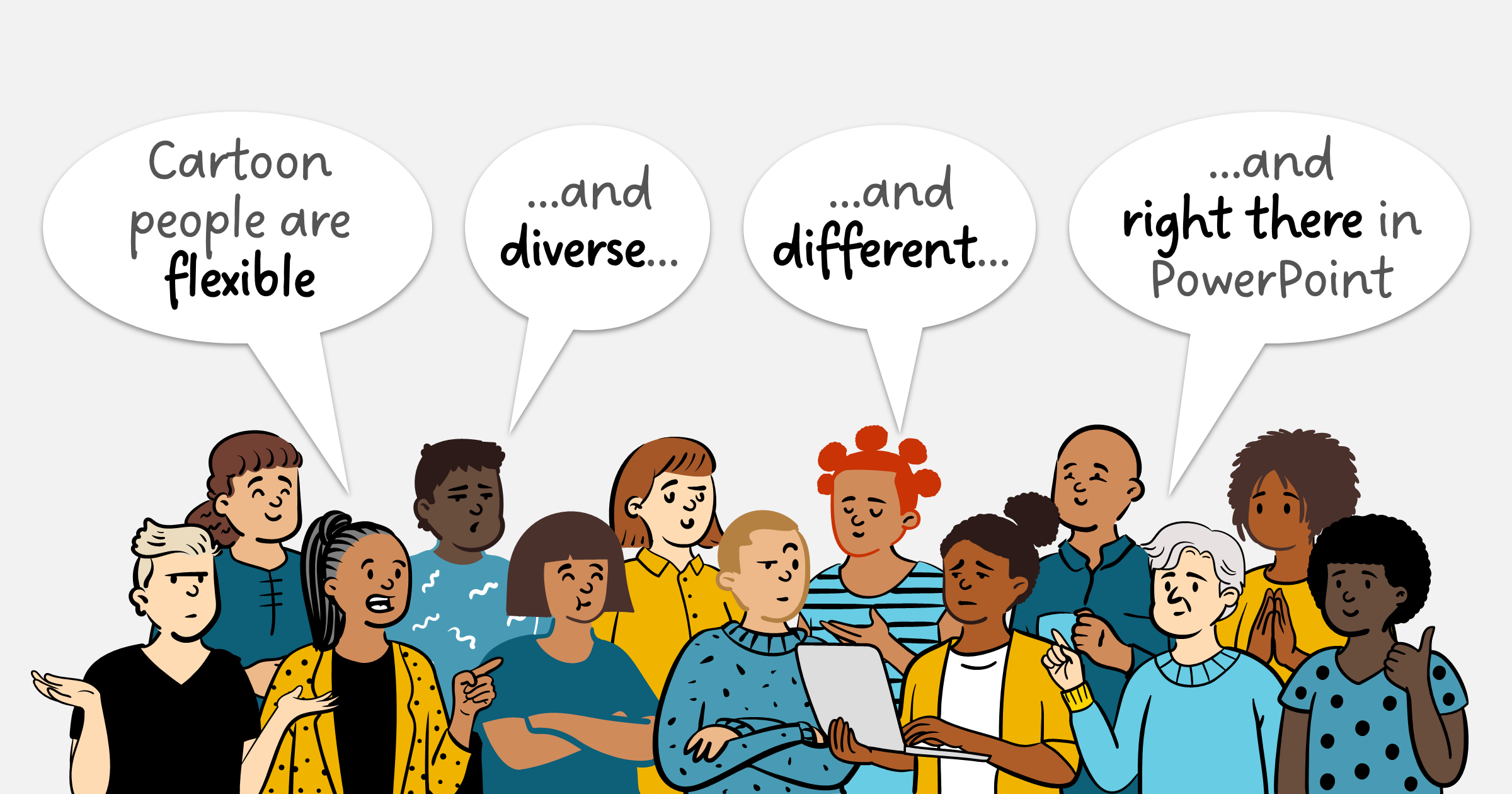
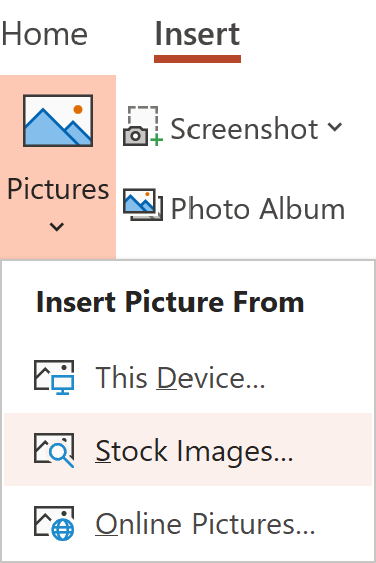
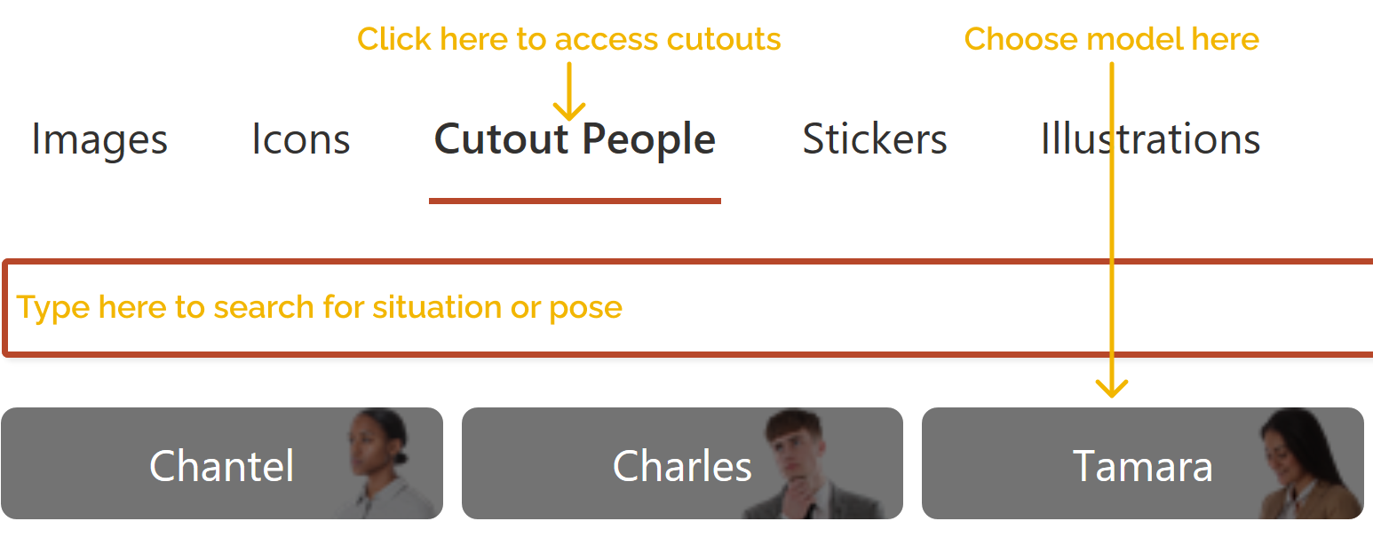
These are a great idea: 34 different people in all sorts of poses with transparent backgrounds. Bonus points again for diverse and ordinary models. You find them by opening the stock images window as before, then clicking on Cutout People at the top.

You can use the cutouts to make communications more relatable. They are a visual indication that the content is about the reader, not the author. For example, use them for feedback comments.
Or to highlight key messages, such as in training materials:
.webp)
Or to highlight key messages, such as in training materials:
.webp)
Illustrations
This is a fairly recent development from Microsoft. More complex than an icon but simpler than a photo, vector illustrations can be really powerful. They use a really nice visual style with shades of grey and one highlight colour that you can change with the Shape Fill tool.

These are all SVG files so it’s possible to apply more than one colour and tweak them, in exactly the same way that you with icons – see this article to find out how.
The first batch included is limited and tends towards the cartoonish, but I hope that we’ll see a later release expand the offering. If you like the idea of illustrations, try the free sites below; make sure you download SVG files.
ManyPixels
DrawKit
IRA Design
Pixabay
unDraw
Icons8
New! Videos
Videos are now also available. We're not sure these have a place in the kind of critical, complex documents that we work on. But if you are creating a team presentation and are looking for something to create that element of surprise or interest, try them out. It looks like when you insert them they fill the screen by default, and they will auto play when you are presenting.

Stickers
These fall into the ‘cute’ category and should be avoided in serious business documents. But if you are going for comedy - maybe in an internal team or social context - then knock yourself out.
Looking for more tips like this?
If you want to find out even more techniques for increasing the quality of your decks, we provide advanced training and PowerPoint coaching. Get in contact to find out more.
Want more tips like this in your inbox?
It's useful*
It doesn't flood your inbox (monthly-ish).


